

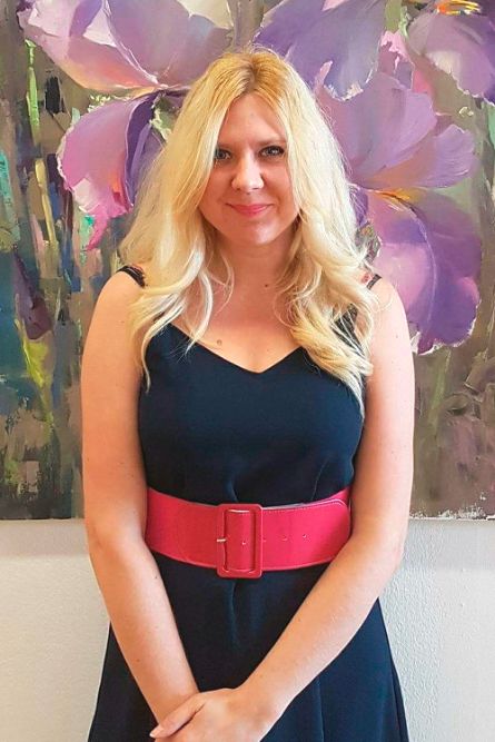
Ekaterina Neshkova.
The Art of Colour
Colour holds a special place in Ekaterina Neshkova’s painting. She is drawn to complex combinations of hues, subtle tonal transitions, light and air — all the elements that shape an immediate impression of what we see. For Ekaterina, colour is a way of conveying not only the subject itself, but also her own sense of its beauty and harmony.
She has a particular affinity with French Impressionism and its fascination with light, atmosphere and the changing nature of colour. Yet her greatest source of inspiration remains the world around her — nature, flowers, beautiful objects and those small moments in everyday life that unexpectedly catch the eye.
This fascination with colour has accompanied Ekaterina throughout her artistic life. She is interested in the way a familiar hue can change depending on the light, the surrounding colours and the material she is working with. A blue can become deeper or cooler, a red more intense, while a green may reveal an entire range of subtle variations.
Her interest in colour has also led to a constant exploration of artistic materials. Over the years, Ekaterina has worked in oils, tempera and acrylic, discovering the different possibilities each medium offers. Whatever the technique or format, she continues to look for richness, clarity and harmony of colour.
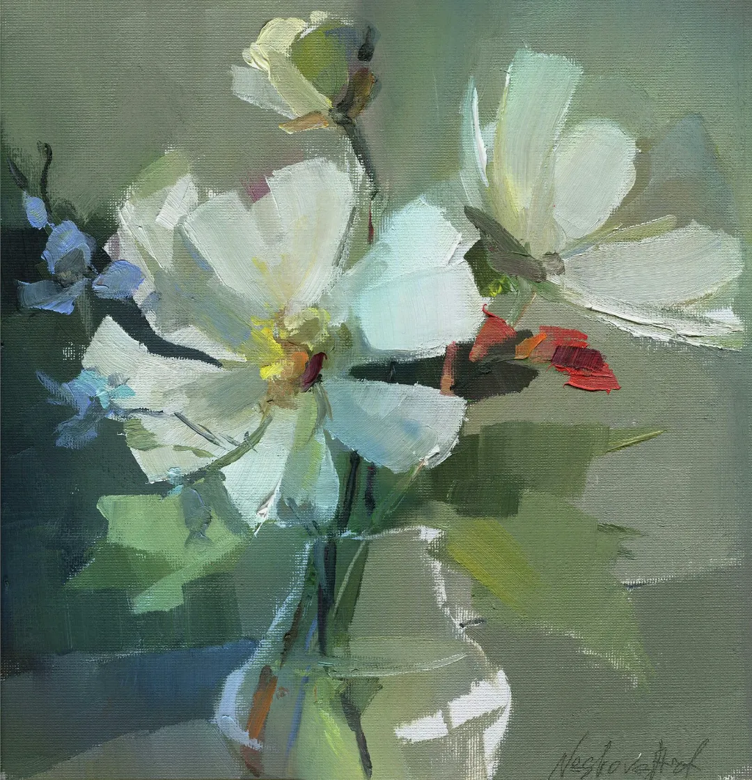
Anemones against a Red Background. Oil on paper, 50 × 50 cm

Anemones against a Red Background. Oil on paper, 50 × 50 cm
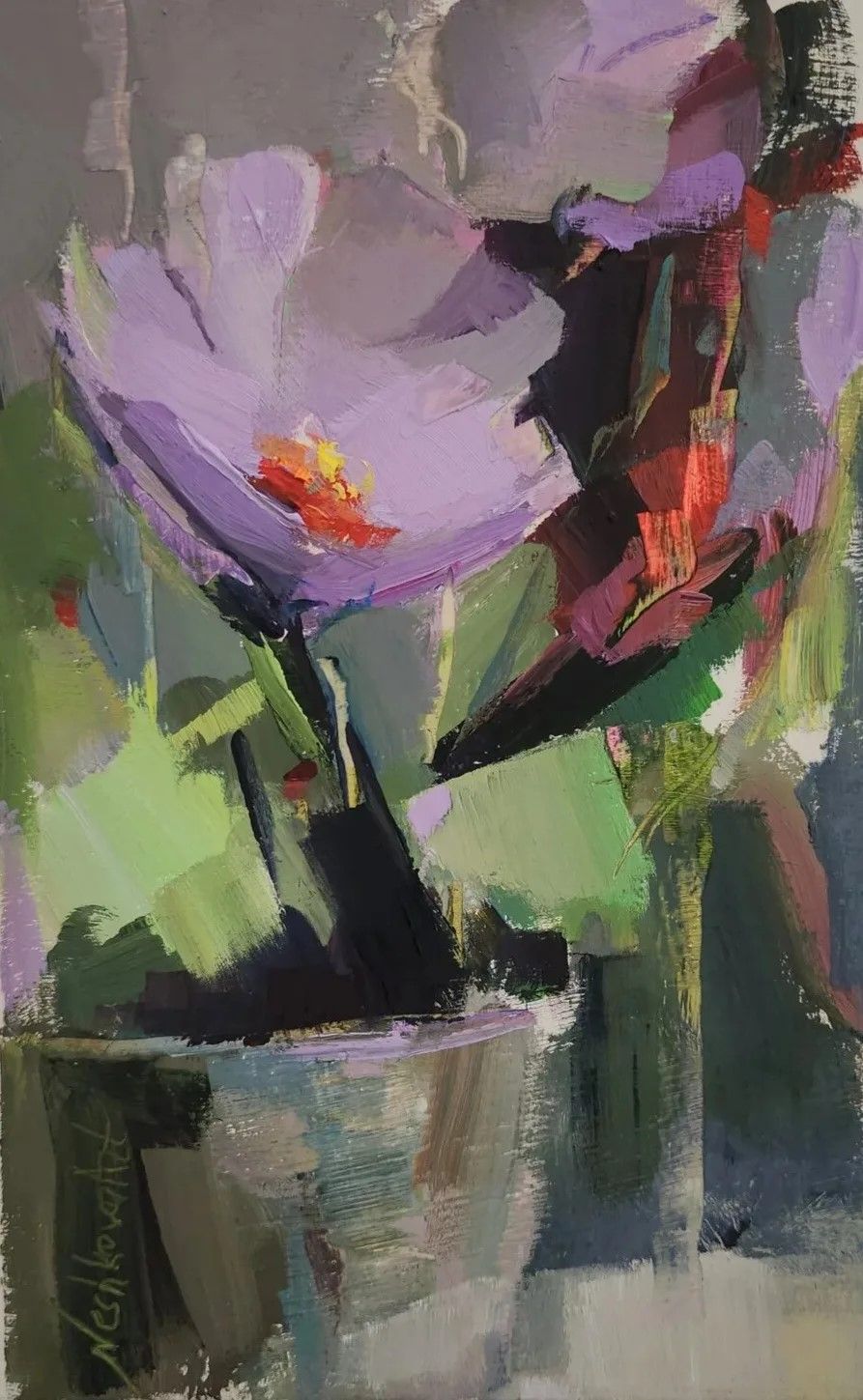
Bouquet with White Flowers, 20 × 12 cm, oil on canvas board, 2025
The Path to Painting
Ekaterina was born in Moscow and has drawn since childhood. Art classes, school drawing competitions and a constant interest in creativity were part of her life from an early age. After leaving school, however, she chose a very different path: she entered the Moscow Aviation Institute, trained as an engineer and went on to work successfully in the aviation industry for several years.
Painting remained part of her life throughout this time. Gradually, it became increasingly clear that she missed the opportunity to work with colour, observe the world around her and create images of her own. What had long seemed like a passion eventually revealed itself as a need that no other profession could replace.
Returning to art required serious commitment. Ekaterina had to rebuild her skills, practise extensively and immerse herself once again in a professional artistic environment. An important stage in this process was studying at the Department of Environmental Design at the Moscow Architectural Institute. It was during this period that Ekaterina became particularly fascinated by colour theory. Her interest quickly extended far beyond the curriculum: she began exploring the history of colour studies, theories of colour perception and the principles governing the interaction of different hues. Gradually, colour became not simply a subject of study, but the foundation of her own artistic language.
Colour as the Language of Painting
Ekaterina is fascinated by the way colour changes according to its surroundings, the light and the material itself. The same hue can behave quite differently in oils, tempera or acrylic — becoming deeper or lighter, more transparent or more intense.
This interest naturally led her to experiment with different materials. At various stages she has worked in oils, tempera and acrylic, exploring the particular possibilities of each. Today, she most often chooses oils for their wealth of colour nuances, softness of transitions and ability to create complex tonal relationships.
For Ekaterina, however, colour theory is never an end in itself. What interests her most is what happens to colour within the painting — how different hues begin to interact, how they change under the influence of light and how these relationships gradually create the overall mood of a work.

Peonies in a Glass Vase. Oil on canvas, 60 × 40 cm
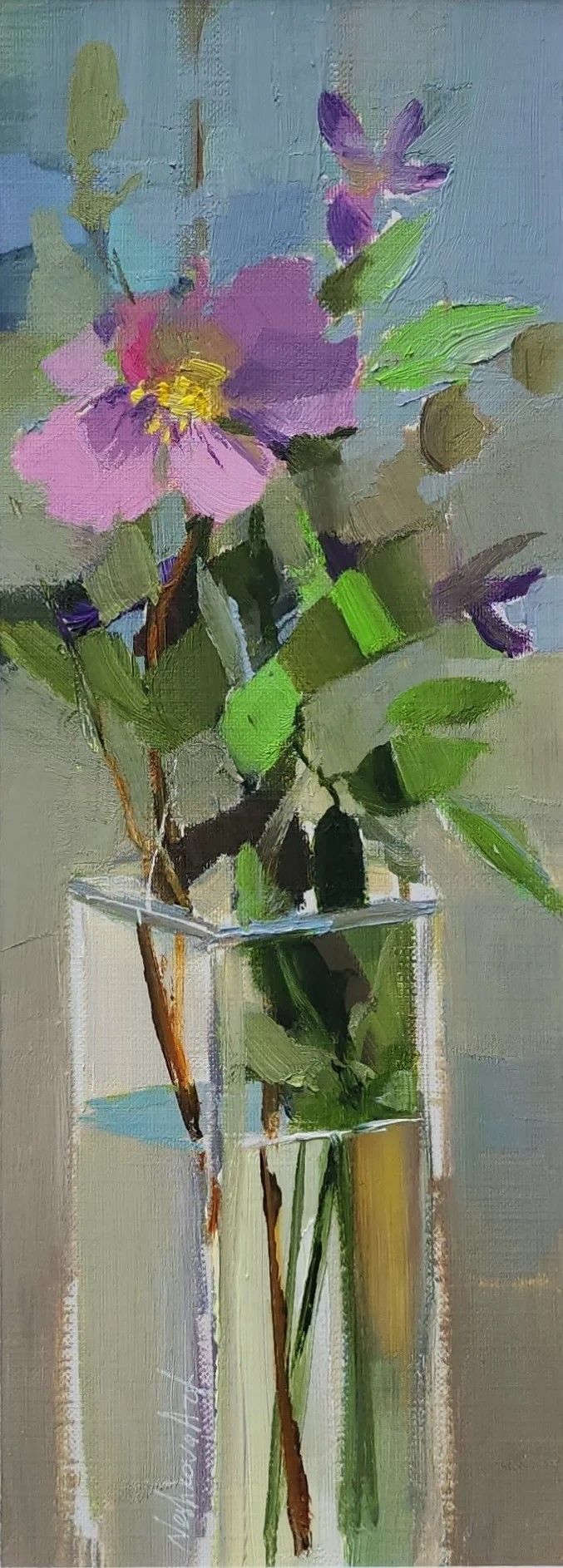
Rosehip Branch in a Rectangular Vase, 23 × 18 cm, oil on paper, 2024
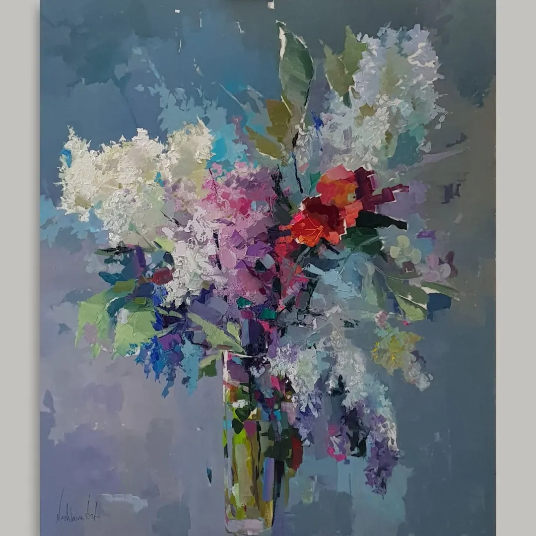
Bouquet of Lilacs. Oil on canvas, 120 × 100 cm
The Artist’s Palette
Ekaterina has worked with Master Class oil colours for many years. She is particularly fond of classic, saturated colours — cobalts, cadmiums and ultramarines. Her palette is rich in clean blues and turquoises, complex, vibrant greens, intense violets and pinks, as well as deep reds and purples. She uses earth colours and ready-made browns relatively sparingly, preferring to mix complex browns herself from other colours. This approach reflects her broader attitude to painting: for Ekaterina, colour is created through the interaction of different hues rather than simply taken ready-made from the tube.
Her palette is rich and varied, but it is the relationships between colours, rather than the sheer number of them, that matter. Pure cobalts, cadmiums and ultramarines provide intensity; blues and turquoises bring light and air; while violets, purples and deep reds allow her to build complex and expressive colour harmonies.
Flowers and Inspiration
Flowers are among Ekaterina’s favourite subjects. Peonies, irises, wild roses and all kinds of wildflowers appear in her paintings again and again. Each has its own character, structure and particular harmony of colour.
Flowers offer an almost inexhaustible opportunity to observe colour. Light, time of day and the surrounding atmosphere constantly transform them: the same flower seen in the morning and in the evening can reveal entirely different colour relationships.
But her fascination is not purely a painter’s professional interest. Ekaterina loves flowers first and foremost for their natural beauty, and it is the desire to preserve that beauty that draws her back to them again and again.
From Large Formats to Miniatures
For many years, Ekaterina worked primarily on medium and large formats. A few years ago, miniature painting became another part of her practice — an interest that began with painting watch dials and gradually developed into the creation of her own collection of jewellery.
She hand-painted pendants and cufflinks in tempera, working on tiny surfaces made from canvas, glass, wood and metal. Each piece was unique.
Miniature painting demanded a very different kind of concentration. On such a small surface, the precision of colour relationships and composition becomes particularly important: there is nowhere for an accidental brushstroke or unnecessary detail to hide. The reduced scale requires the artist to select only what matters while still retaining the sense of a complete painting.
Her interest in miniatures has not replaced traditional painting. Today, Ekaterina moves freely between small works and larger formats, choosing the scale according to the idea and the needs of each particular work.
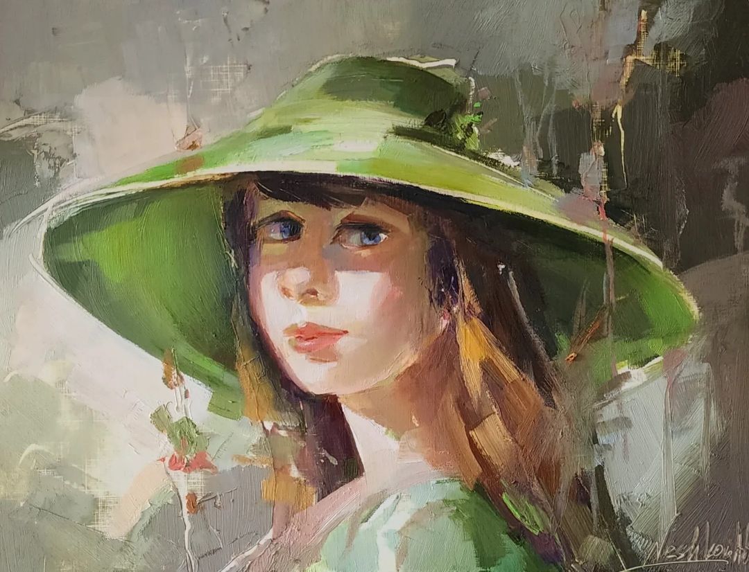
Redhead in the Forest, 35 × 23 cm, oil on paper, framed with a mount, 2025
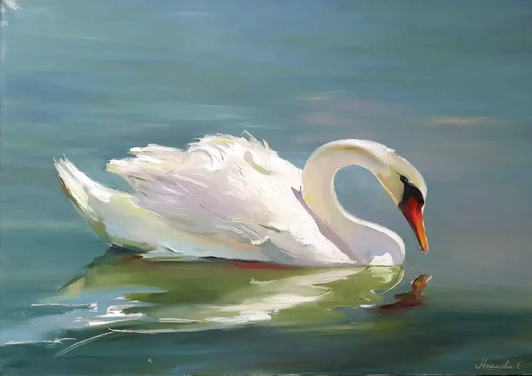
The Swan. Oil on canvas, 100 × 60 cm
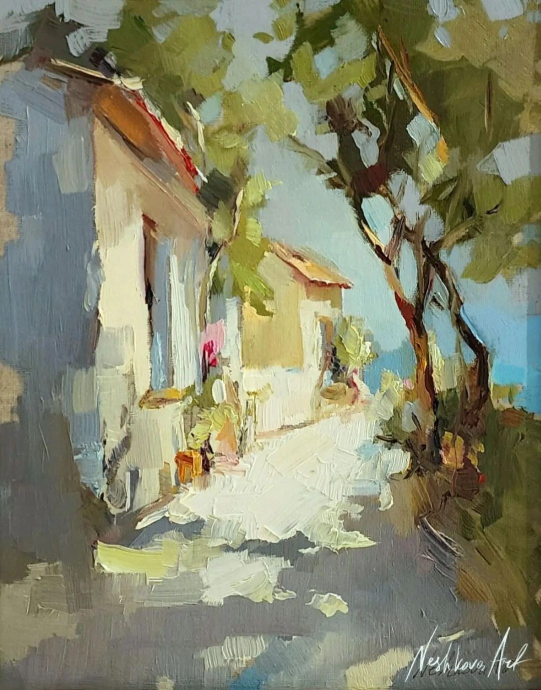
Two Trees by the Sea, 24 × 18 cm, oil on canvas, 2023
Beyond the Canvas
Ekaterina’s interest in art has long extended beyond painting itself. For her, the entire life of an artwork matters — from the first painterly decisions to the way the finished piece will ultimately exist within a space.
This led to an interest in frames and mounts. Over time, Ekaterina began framing her own work, carefully selecting materials, colours and proportions, and later started creating handmade bespoke mounts. She sees framing not simply as something added to a finished work, but as an opportunity to continue its artistic idea.
As a result, traditional painting now exists alongside miniatures, hand-painted jewellery and bespoke presentation. The scale and material may change, but her fascination with colour and harmony remains constant.
ON PAINTING
Ekaterina has always been inspired by the beauty of the world around her — in nature, flowers, works of art and ordinary everyday things. She does not see beauty as something separate from serious art, nor is she afraid to speak about it directly.
For her, the pursuit of beauty begins with paying attention to what surrounds us: noticing a subtle combination of colours, a change in the light, the shape of a flower or an unexpected harmony between a few objects — and then trying to preserve that feeling in paint.
It is from this attentive way of looking at the world that her works emerge — different in scale, material and technique, yet united by a love of colour and a desire to convey her own impression of what she sees.

Bouquet against a Turquoise Background, 27 × 27 cm, oil on paper, 2024

Pumpkin-Coloured Flowers. Oil on paper, 30 × 30 cm
Two Trees by the Sea, 24 × 18 cm, oil on canvas, 2023


CRM-форма появится здесь